What is meant by “UX Design”
UX design can mean different things to those who practice it as well as though seeking to learn more. UX design has been generally accepted as focused on the user experience with a product. According to a study within the Oxford Academic’s Interacting with Computers, the goal is to “improve customer satisfaction and loyalty through the utility, ease of use, and pleasure provided in the interaction with a product.”
Now, UX design can apply to many products, but our focus shall be on digital products, specifically websites. A part of web design, from conception to published, is concerned with how user’s will interact with the interface. Things to keep in mind are ease, enjoyment, and that user’s are able to discover what they are seeking.
Ease
A phrase that is helpful when regarding ease within UX design is: no thought/effort required. The simpler it is, the better. Many people don’t want to have to put in a lot of effort to find what they are searching for. We aren’t archeologists on a dig. We want the bones to be found above the dirt.
Enjoyment
Enjoyment shouldn’t be overlooked. The pleasure user’s have interacting with your website can be a major influencer on retention rate, as well as future loyalty. Enjoyment comes from the aesthetics (how the website looks, the images, etc.) as well as the interactions.
Discovery
How easy it is for user’s to get from point A to B while getting their desired outcome–from purchasing an object, to learning more information about a service or subject. This is where a lot of value of the site comes from. If your user wants to purchase an item, but can’t figure out how to add it to cart or find it, your use of a website is null.
Implementation
It can be hard for even UX Designers to agree to a specific definition of what it is they do, but many statements regarding this are customer-centric. Therefore, one of the first steps required for your website and understanding UX design is to understand your users.
Who are they? What are they searching for when they go on the web? What value is your website providing to them? What are their likes/dislikes?
The list can go on and on. But getting into your user’s mind is vital. Your website needs to be a continued representation of your brand, while understanding there are a bunch of touchpoints user’s may interact with and ensuring they are pleasurable while still fulfilling the user’s needs.
Examples
Bad UX Design vs. Good UX Design
Elevator Buttons:

This is an example of poor product UX design. It’s confusing as to which buttons you push as well as why there are so many floors/numbers missing. This fails in regards to ease of the user accomplishing what they are seeking to do: make it to their desired floor.
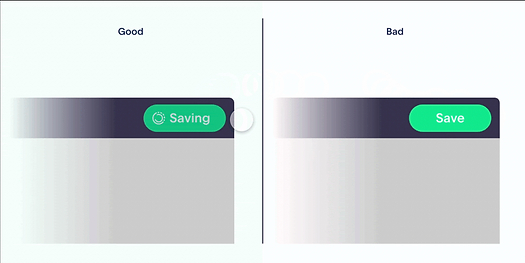
Indication of Saving:

This poor vs. good UX design can be hard to distinguish at first. However, there is something called “visibility of system status” that explains why it is poor. If the save button is clicked and nothing happens, there is no indication of change (as in the saving is happening)

then users can be left confused as to if they actually accomplished their desire (saving). Versus, when there is an indication and the user can confirm the action was recognized, you can avoid this confusion.
This example was pulled from Adobe and they offer further examples of technical UX designs, both good and bad, with digital products.
In Closing…
Understanding UX design isn’t something that is going to happen with one article. Don’t be discouraged if you have trouble with it. There are a lot of resources online that can assist you and many people willing to help and explain further.
As stated above, the first step is putting yourself in the user’s shoes. Poor web design is different from poor UX design; although the first can contribute to the latter. We at LiveFive Web Design are more than willing to answer any questions you have as well as assist you moving forward.
Connect with us on LinkedIn–we’d love to hear from you!


