Once you are online, it is important to ensure your mobile-version of your website is just as friendly and responsive as your desktop version. As previously discussed, mobile internet searches continue to increase each year. Some may only find you through your mobile version. If it fails to meet expectations, you can loose potential customers and impact your brand’s reputation.
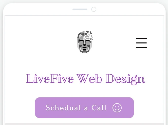
In most cases, your desktop version will simply “shrink” to fit the mobile. This doesn’t mean it will translate over properly however. We will use our website, LiveFive Web Design, to exemplify this.
Without checking the mobile version or re-sizing and making edits, words can appear on top of one another or off the “page”.

Additionally, graphics can not adjust accordingly and be hard to understand–making their use pointless.

It is vital these kinds of errors are spotted early! Preferably by you or a member of your team rather than brought to your attention from a user. As stated in the previous post, ensure that your mobile sight takes the mobile user in mind. How people view websites and interact with them will be different than when they are sitting down at a desktop. They are scrolling with their finger and even what we get caught by may be different. Running drafts by potential users is a helpful place to start.
Another thing to keep in mind is mobile friendliness is different than responsiveness. Mobile friendliness refers to how things are view/seen on the page. Mobile responsiveness refers to how users interact with that information (such as clicking on a button or a menu option).
LiveFive Web Design has expertise in creating an optimal mobile site. Contact us today to learn how we can update your site or ensure your new one is masterful from the start.


